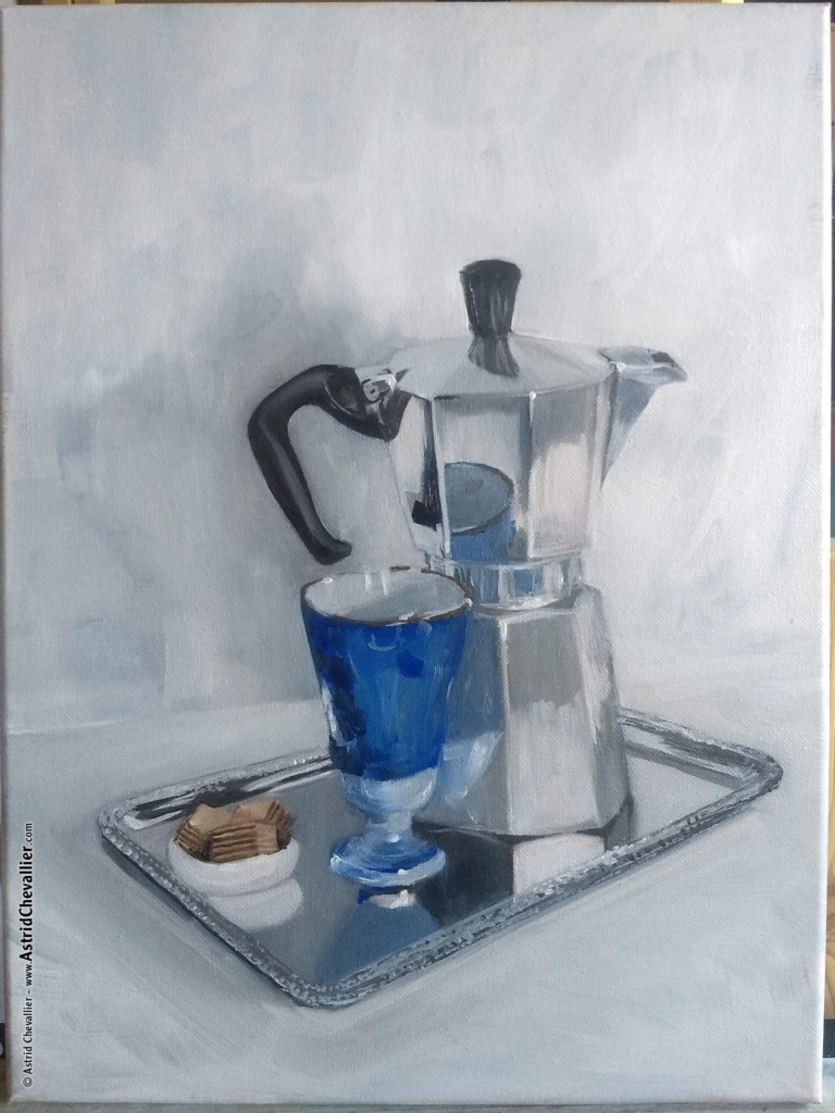
The Making of “Coffee Time”
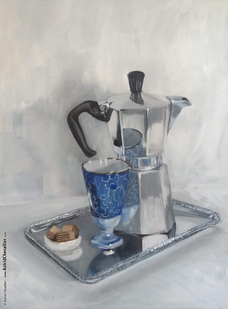
“Coffee Time” –
Oil on canvas by Astrid Chevallier.
12 x 16 in.
Session 1
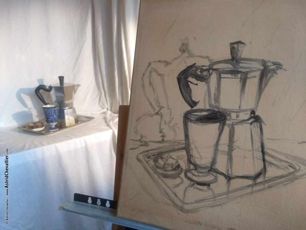
Part 1 – This is the very early stage.
The canvas has been stained – with Burned Umber – so that it’s not all white, and I mixed Burned Umber and Ultramarine Blue to get a nice rich “Black”, to sketch the composition.
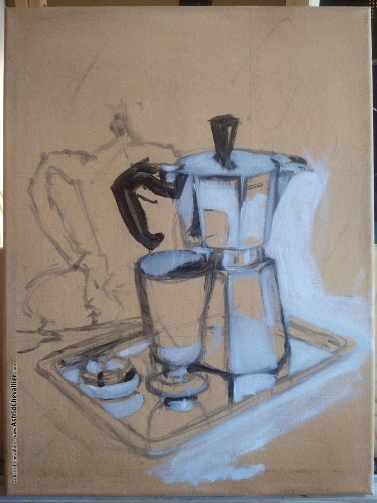
Part 2 – Get some dark and light values on board.
Refine the sketch as needed.
Keep in mind that nothing is final at this stage, it’s OK to be loose and let things happen.
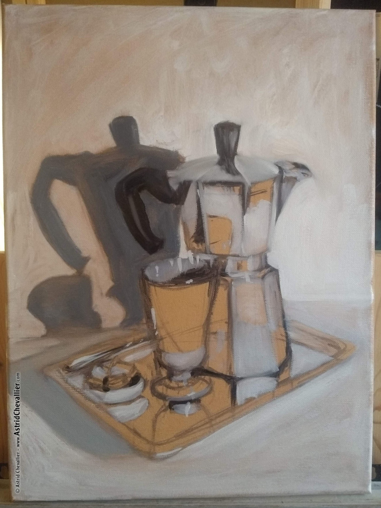
Part 3 – Get the background covered.
Somehow. The burnt umber tone is hard to cover with that first layer of white and light grey, but it’ll provide a warm undertone in the final stage that should work (subtlety) well against the metal grey-blue colors…
Part 4 – Let’s bring some blue in the picture…and cover most of the challenges at task.
Part 5 – Refinements.
Now that most of the composition has received a first layer of paint, it’s time to take a broader look and go over some little subtle changes (the reflection of the handle, the color of the shadow inside the cup, and overall more definition…) in order to rebalance the values.
Session 2
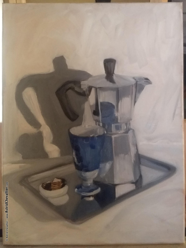
Part 6 – The next day I stepped in the studio at an earlier time, and I really liked the soft and diffuse shadows the natural light was casting on the backdrop, as it allowed the still life to be more present.
So I rearranged the background a bit, going for much softer cast shadows, while keeping the contrast on the still life.
Part 7 – Now that pretty much everything is in place, it’s time to go back and re-assess a bit of everything:
– re-draw the handle
– refine the reflection of the cup
– work on the cookies (it’s quite “risky” to have cookies as props when you have loved ones popping up in the studio several times a days, lol)
– add a brown rim to the cup (a subtle details but it brings some more natural tones in the picture.)
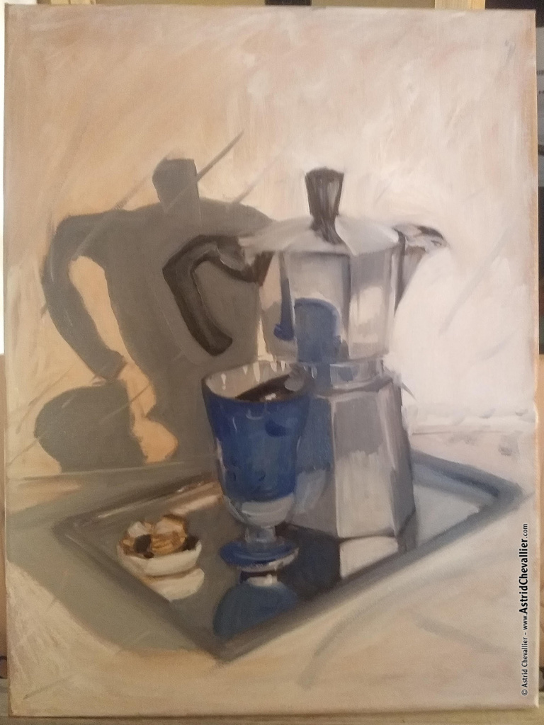
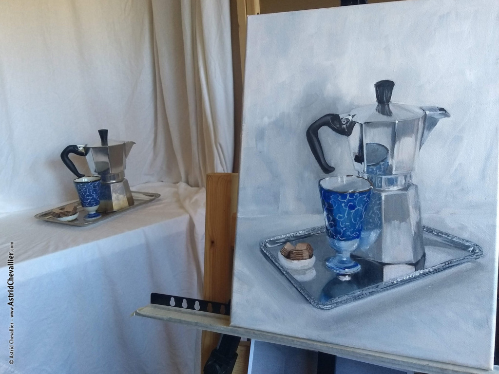
Part 8 – Now is the time to take care of the big elephant in the room…the tray!
The perspective got a bit freestyle, and there’s not much details. Because it’s a tricky element, it’s important to take it slow and find a way to treat it nicely while not getting overwhelmed. My goal is to give as little elements as possible, yet enough that the viewer’s eyes and brain are going to connect the dots and assume it it what it is.
So, first: let’s aim at correcting some angles, and exploring textures.
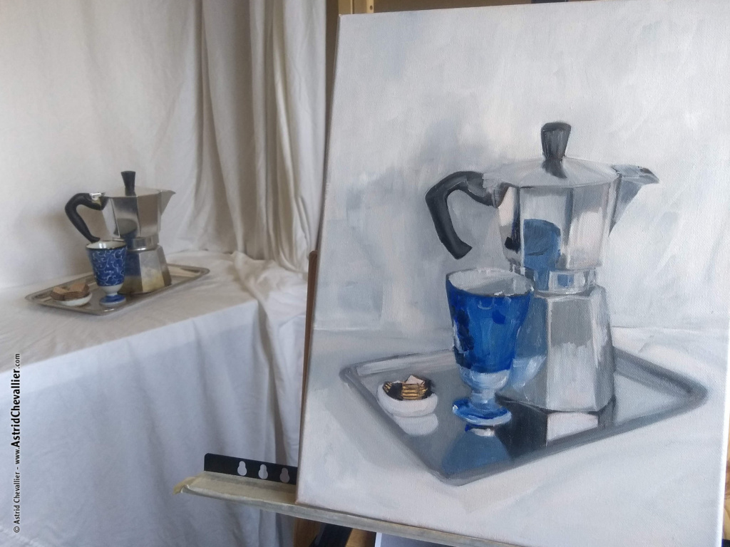
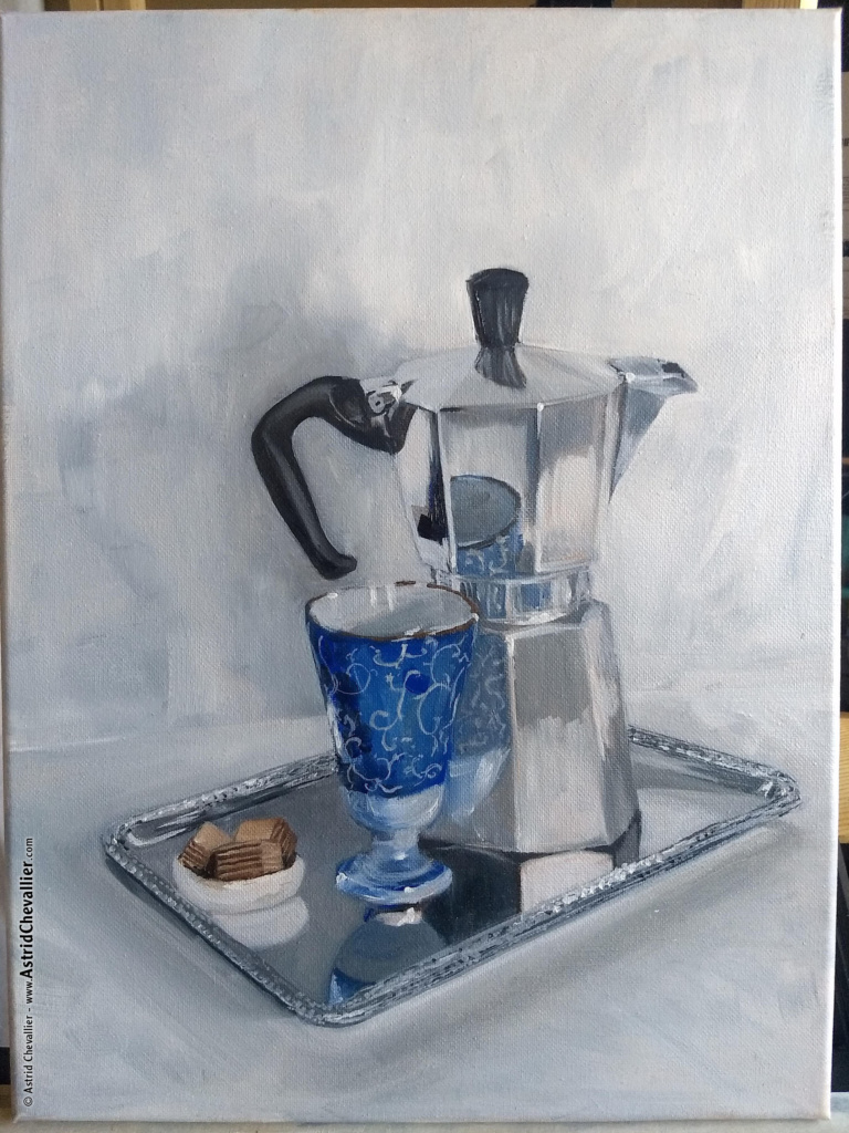
Session 3
Part 9 – The perspective and shadows of the tray have been adjusted again. t can take a while, that’s OK.
The cookies have become more defined.
More importantly, there’s a painted flowery pattern decoration ornamenting the cup and its reflections. Most of it is very light grey, but the parts facing the light are almost white.
In the metallic reflections, everything got a bit less saturated, yet very sharp, for a realistic effect.
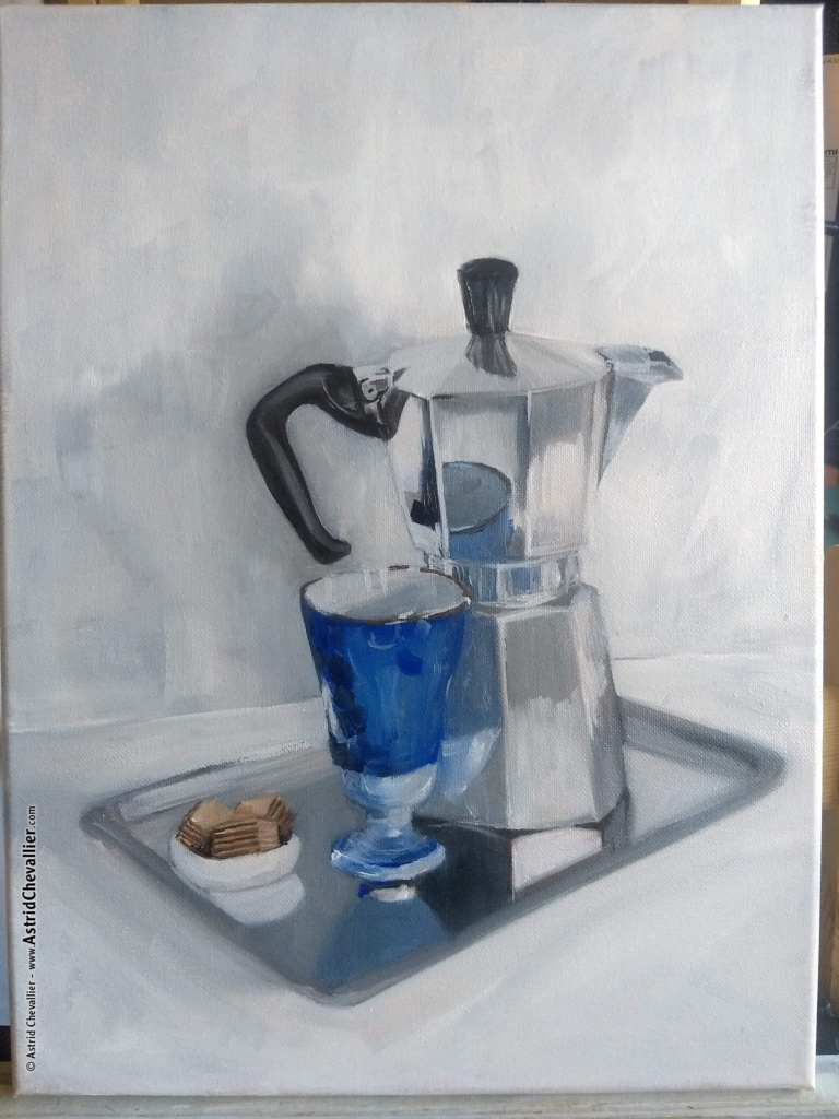
Part 10 – A few mode details have been added, mostly in reflections and highlights, some shadows, and the tray.
At this point one could either do a lot more, or let it go.
I’m pretty happy with how this adventure unravelled, and although it’s always tempting to revise one more time, I know that one unfortunate brush stroke could ruin it all.
So, I learned to call it done, and this one is.
—
Feel free to email me with questions or inquiries.